


-
— Type: Public NASDAQ (META)
— Category: Technology conglomerate
— Net Revenue: 62B/annually -
Coming soon
-
Coming soon


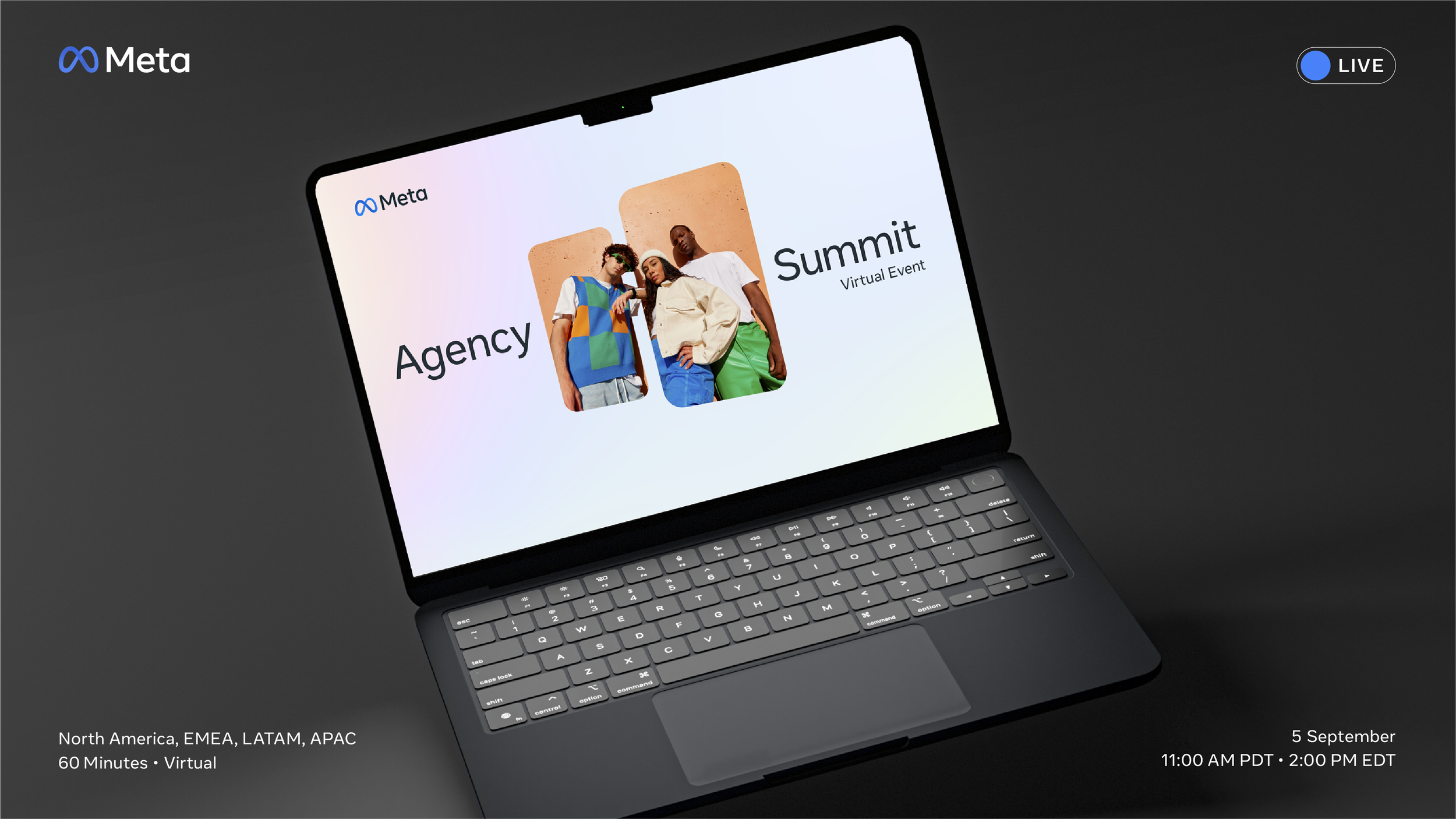
Meta x Agency Summit (Virtual)
Meta x Agency Summit (Virtual)


-
— Type: Private
— Category: Financial Technology
— Net Revenue: N/A -
Coming soon
-
Coming soon


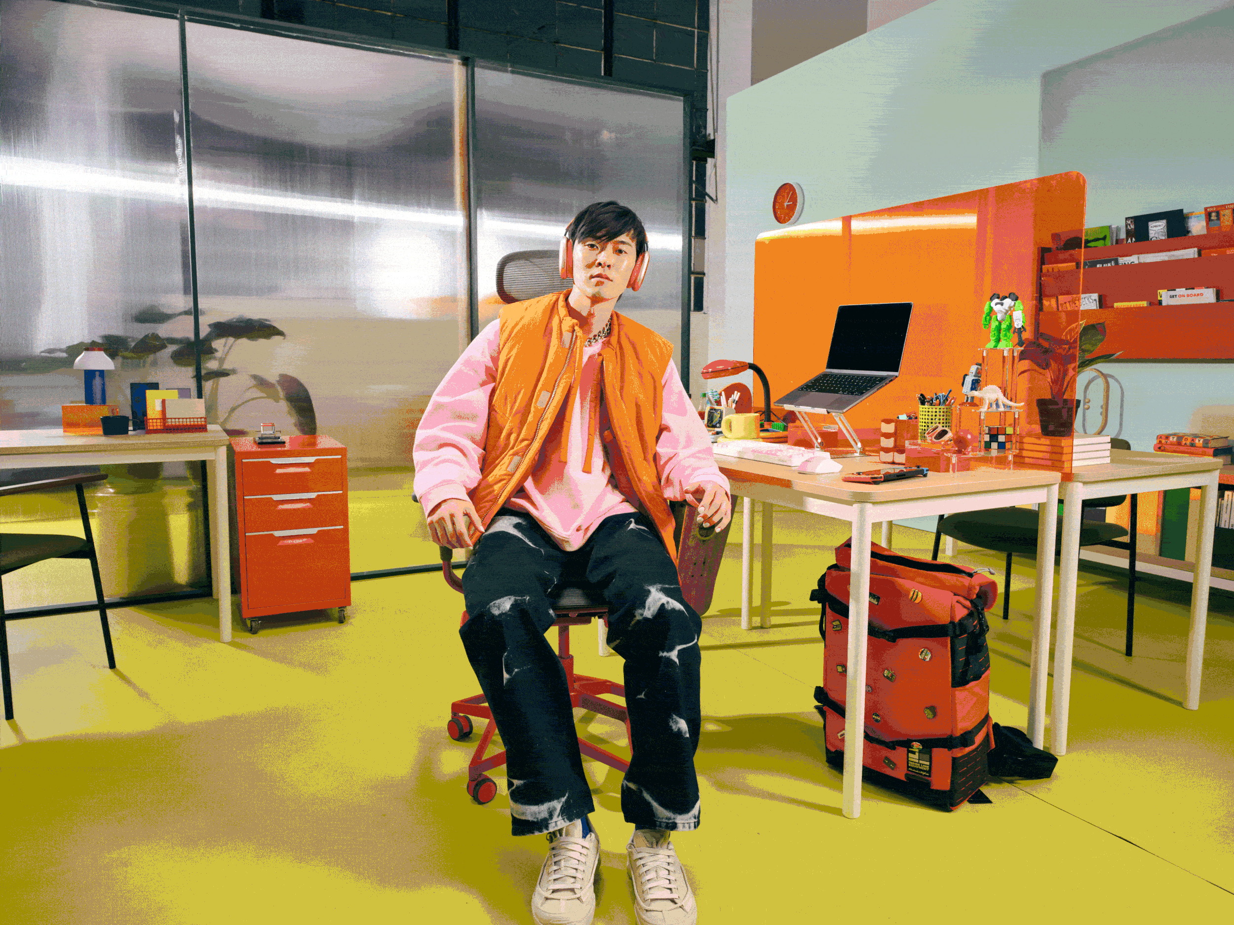
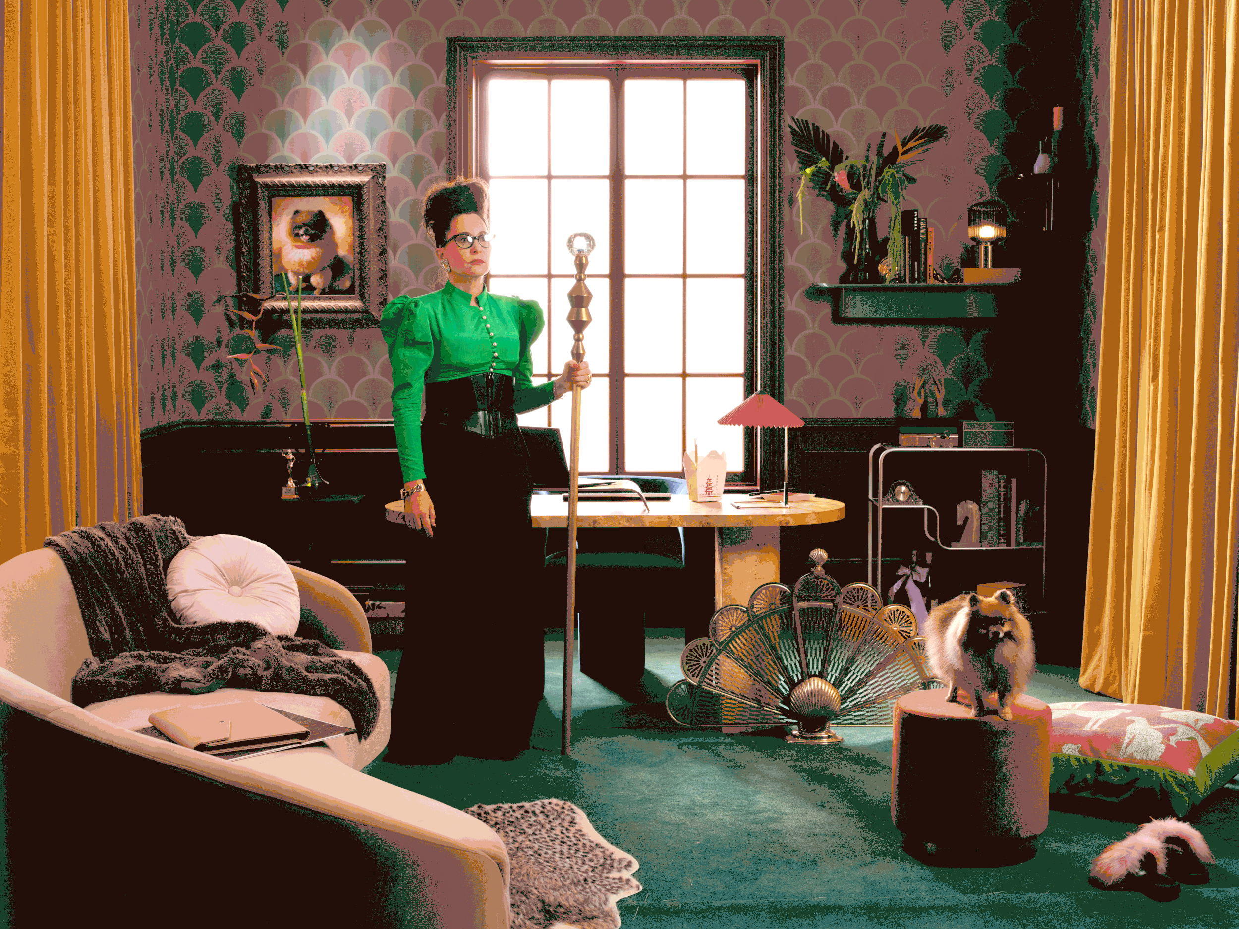
Tipalti by Michelle Watt
Tipalti by Michelle Watt
Photographer 🔗
Photographer 🔗


-
— Type: Public / NYSE (NKE)
— Category: Athletic Apparel
— Net Revenue: 50B -
The ask was simple; re-invigorate Nike Football’s US Instagram page (not soccer) with a new editorial content calendar focused on four strategic areas of focus.
The Focus:
— Emotive storytelling about the unspoken/unseen work it takes to be truly great at the sport at every level.— Campaigns and thematic creative moments; having fun and experimenting with individual franchise NFL players, sponsored teams, schools and cleat launches with fresh, relevant, creative thinking and tactics for the social space.
This includes social support around national ad campaigns.— Cleat drops and launches; a large foundational piece for the football vertical in addition to apparel (clothes and accessories)
— The work needed to span from youth football (NFL’s Play 360 program) to High School to NCAA College to the NFL.
-
With the natural high bar of art and design Nike is accustomed to, the creative direction and vision for the focus areas was open to explore and challenge. It was also about getting to the right athlete stories to resonate with the audiences.
We started by identifying a few younger NFL standouts bringing their philosophies to light and packaging a narrative series around them - photo, video, and graphics.
Cleat drops and launches gave us the opportunities to craft some trendy design for cleat culture and the community (cleat heat) centered around the shoes for the sport. Part status symbol, part iconic for the athletes and fans of the game.Overall, the design is fresh, flexible, modern, new, and experimental for a space that needs all of it.
Nike x US Football
Nike x US Football


-
— Type: Public / NYSE (V)
— Category: Digital Payment Technology
— Net Revenue: 15B
— Sponsorship: Global NFL -
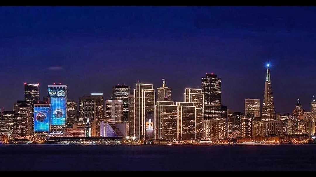
San Francisco was hosting Super Bowl 50 in Santa Clara along with producing a large fan festival in the city at the foot of Visa’s headquarters — One Market and Embarcadero streets, San Francisco’s waterfront across from the historic Ferry Building.
Visa saw this opportunity as a global sponsor of the NFL to celebrate its home market, the game, the fans, the spirit of being founded on the West Coast, and to reinforce championing digital innovation — in a big way. It was also a chance to make a statement as a home town company, and celebrate one of American’s premier, iconic sporting events once a year.
The brief was to projection map large digital stories and vignettes directly onto the two towers of Visa’s One Market building - 36 stories up. No small feat. -
Working with the various animation and AV production agencies, a series of 10, 30 second sequences were concepted to win approval from the local San Francisco government for permitting.
Given the city’s laws about outdoor advertising, the approach to the art was focused on civic engagement and celebratory storytelling vs. brand and advertising. Surprisingly, the city approved the large Visa x Super Bowl sponsorship logo lockup on the highest building tower to frame the digital projections happening below.
For a larger footprint, the decision was made to project on both towers of One Market, displaying seamless visuals across both surfaces. This is a combined 60 floors of visual coverage.
The animated and live action sequences featured; local iconic Bay moments, NFL football content, surreal effects and 3D optical illustrations using the buildings architecture, and more “branded” moments with Visa’s colors and graphic language.
Visa x Super Bowl 50
Visa x Super Bowl 50


-
— Type: Public / NYSE (V)
— Category: Digital Payment Technology
— Net Revenue: 15B -
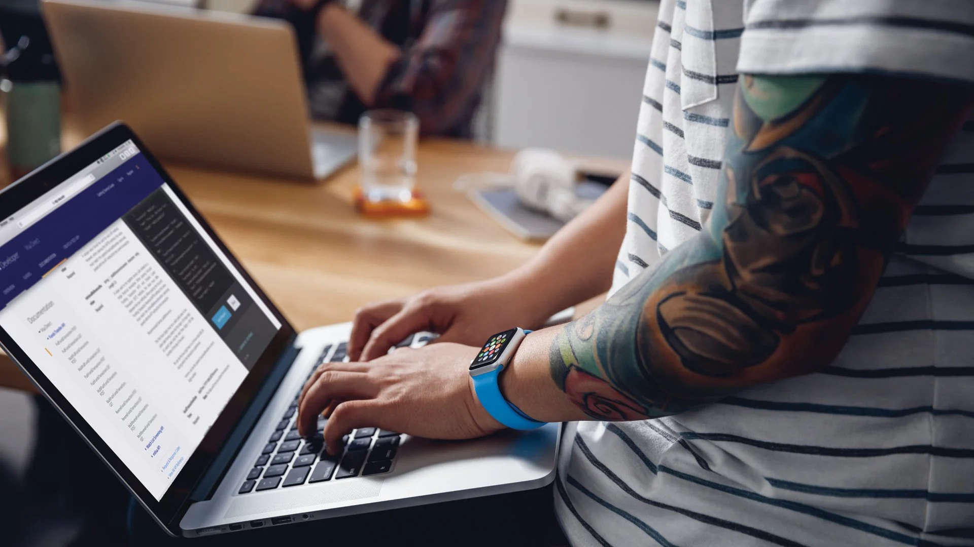
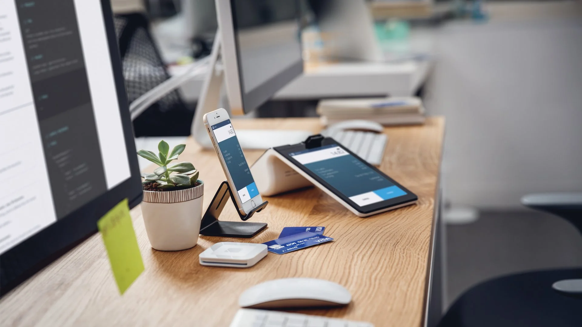
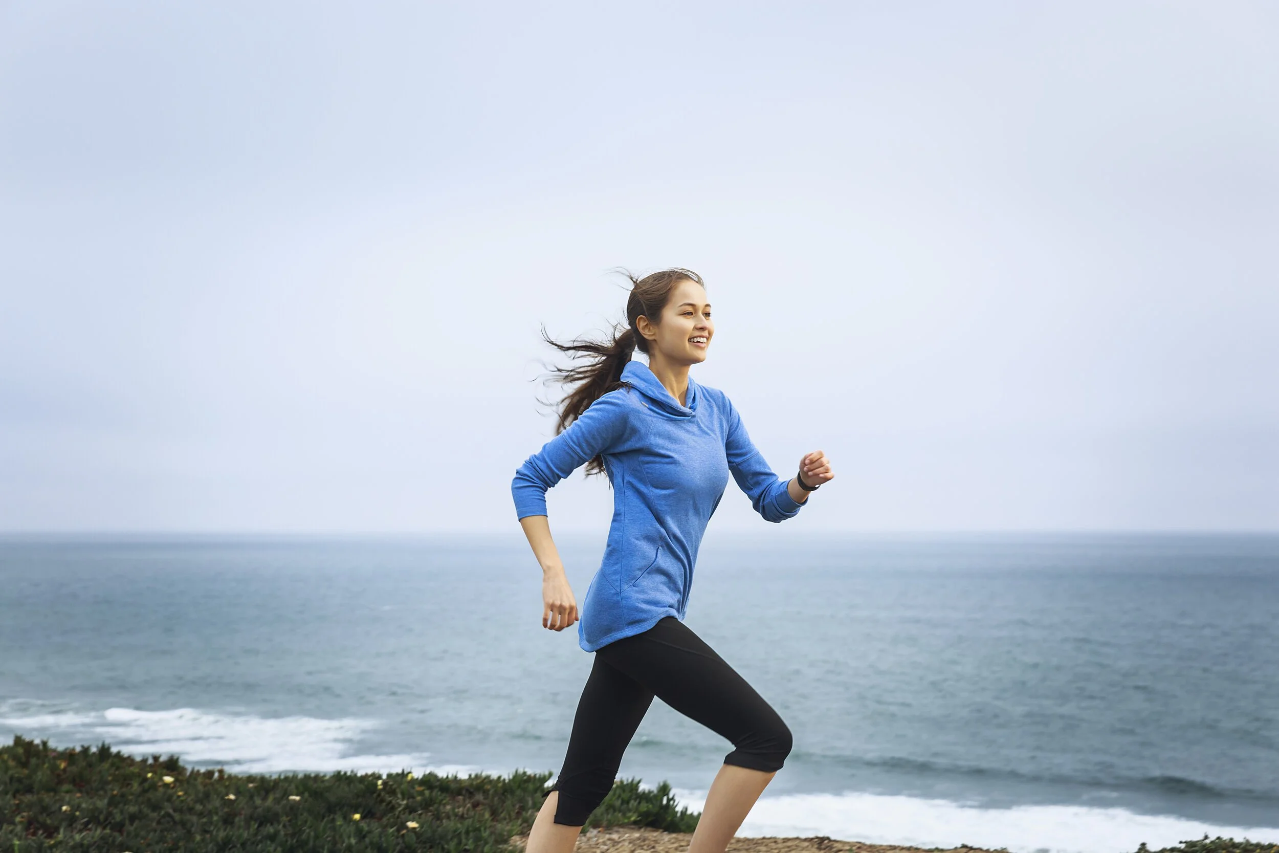
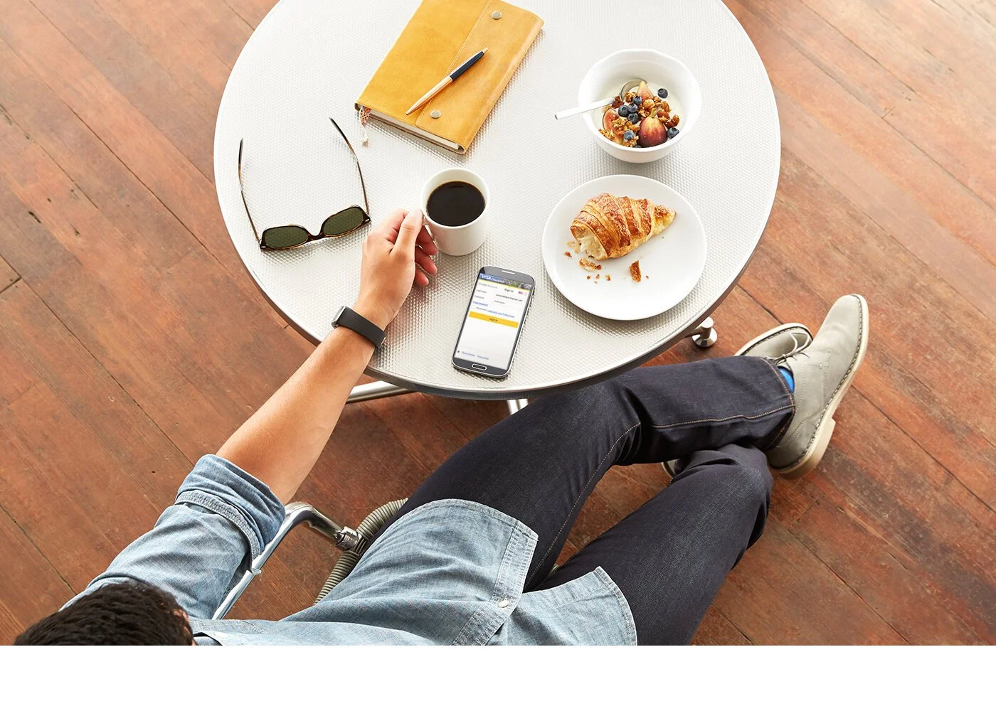
Visa Checkout was launching as a first ever consumer facing digital product for Visa in e-commerce. The ask was to shoot a brand photography library for the product for use for marketing, advertising and events. Not product marketing per se, but more brand level aspirational photography showing people in real life scenarios with a sense of optimism
Visa Developer was launching as a first ever release of Visa’s API’s to the world to build with. The ask was similar to Visa Checkout’s, a brand photography library. In this case, the talent in the photography needed to feel real to convey true authenticity for the audience and partners. And the environment in which the photos were taken in needed to be very realistic for the subject manner as well - a startup world where creating and building was happening. An entrepreneurial feel with positive possibility.
-
The photo direction for Visa Checkout is fun, bright, clean, and diverse showing people in modern settings being free to do things with ease. Ease and simplicity were cornerstones of the e-commerce checkout product experience. A confident, secure and warm feeling was important to visually communicate because of the product’s security features. You needed to feel this aspect in the photography.
The direction for Visa Developer has a similar approach for the photography. We created a narrative scenario for the photo and video shoots depicting a team designing, building and shipping a product together with Visa technology. As an additional layer of authenticity, we cast real developers and engineers allowing them to feel comfortable and natural in the setting.
Visa x Checkout & Developer
Visa x Checkout & Developer


-
— Type: Public / Nasdaq (UAL)
— Category: Air Transportation / Airline
— Net Revenue: 45B -
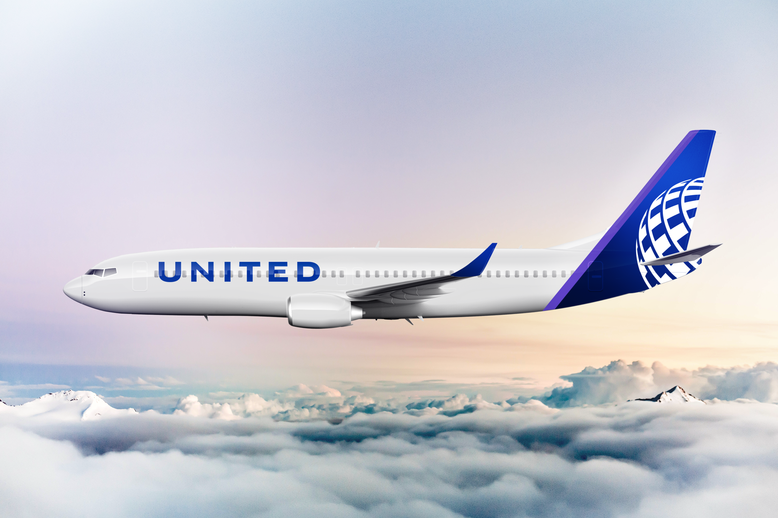
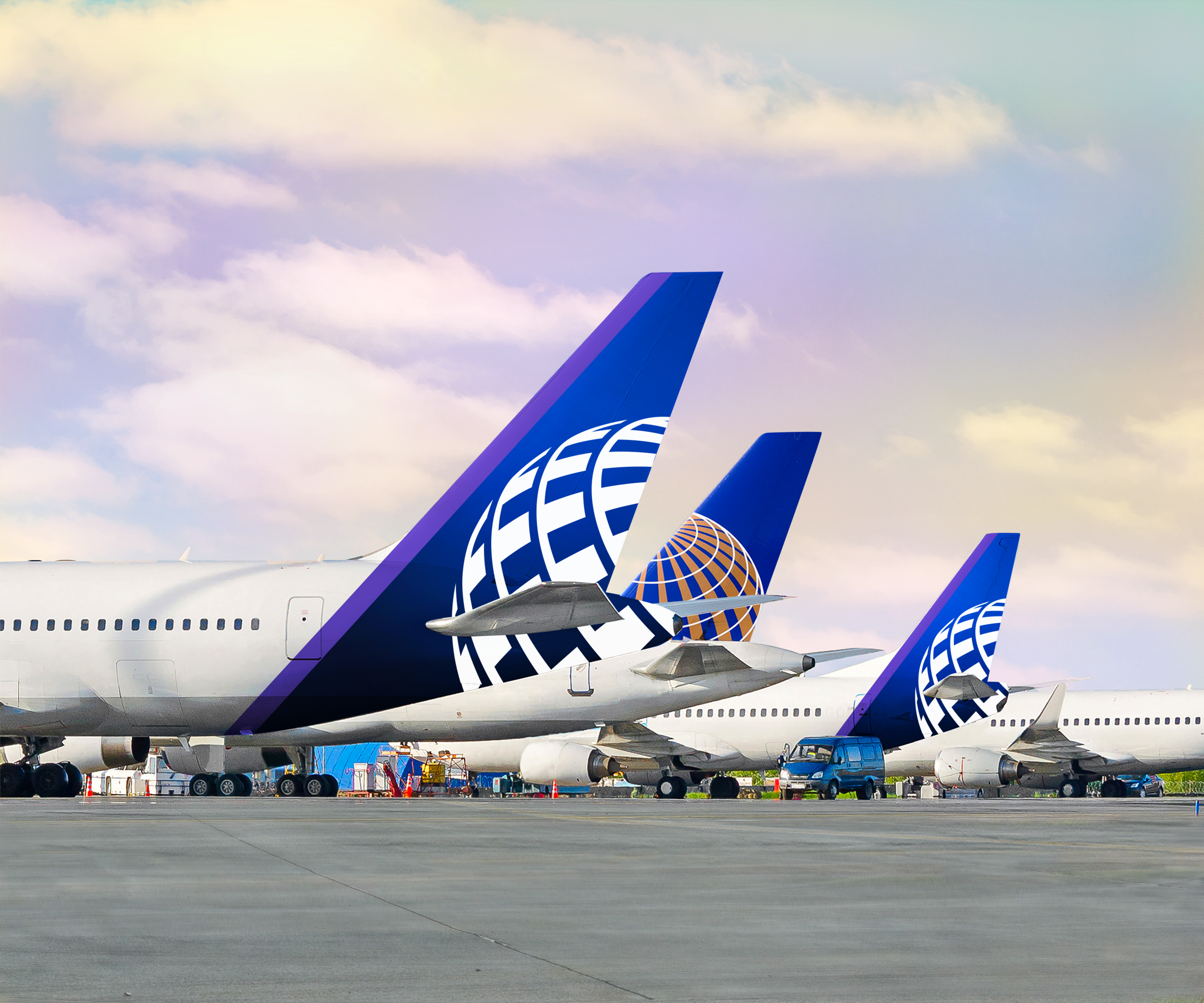
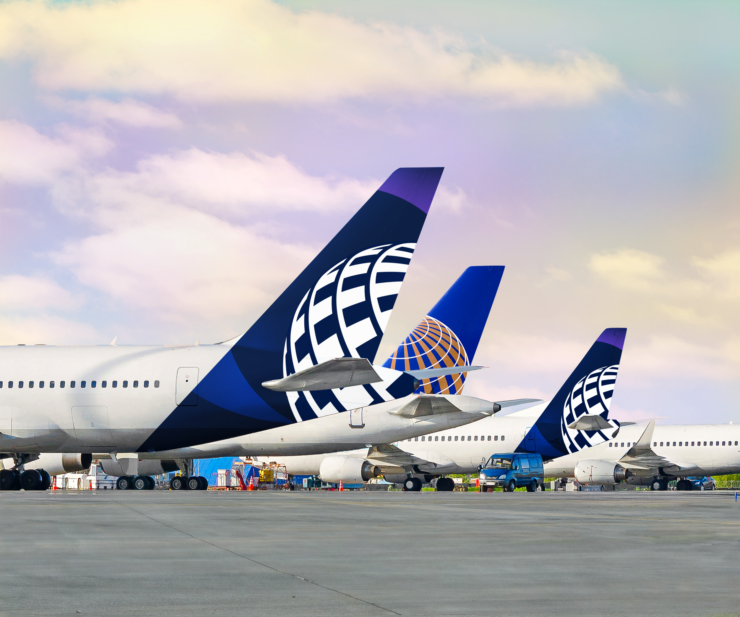
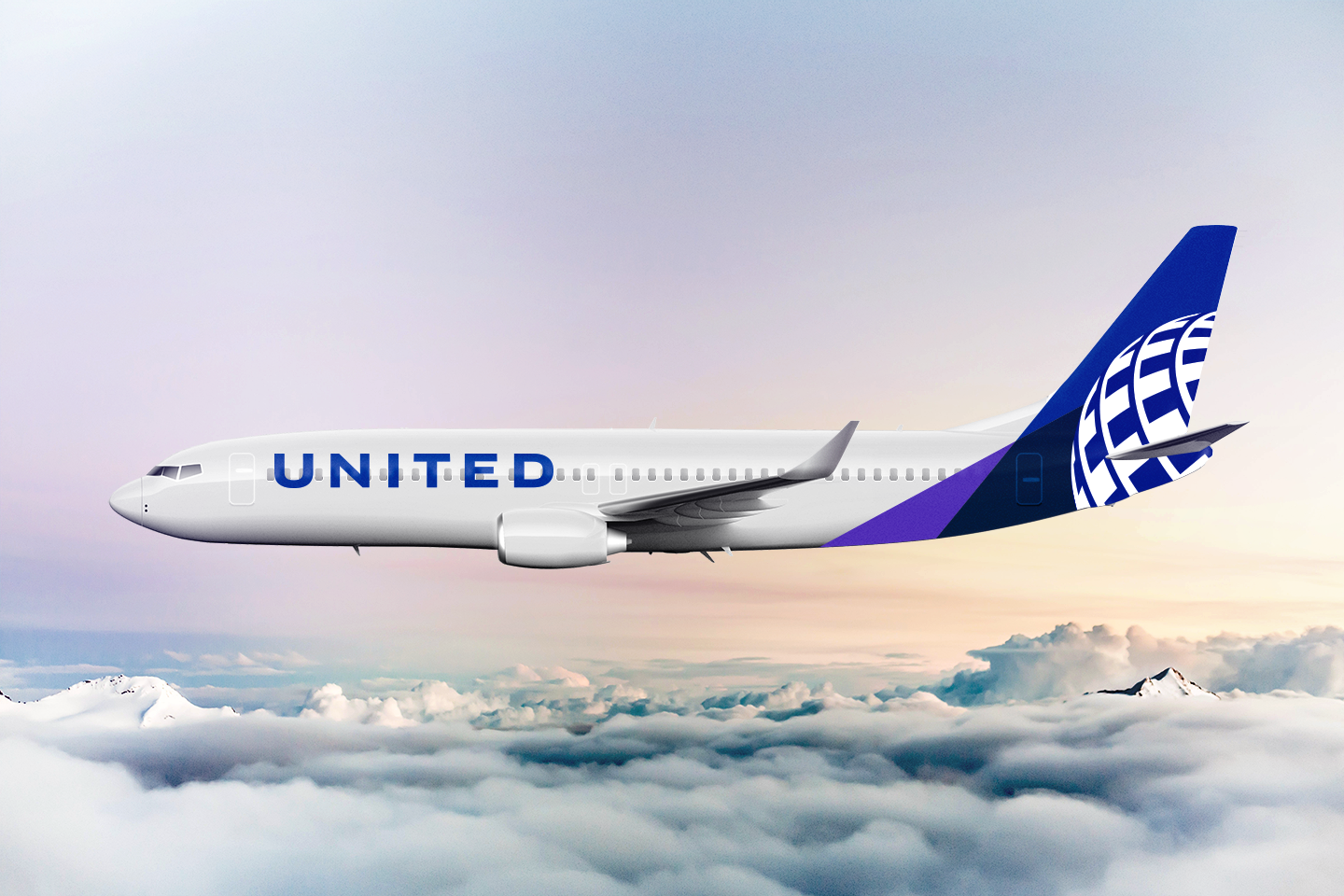
The airline livery is the most iconic piece of art and design for brands in the air transportation (airline) category.
The ask was to create evolutionary, flexible design directions for United’s new livery, that meet current painting criteria, leverage sacred brand assets, and utilize elements of United’s refreshed brand toolkit.
The globe supergraphic was a by product of Continental Airlines. United acquired the airline years prior, and the globe was still in it’s original color palette. The United hero brand was updated and a new livery was needed to pair with the updated look/feel.
-
United’s new brand positioning is; We’re All Travelers. Together.
A literal and human acknowledgement of what each flight represents. People getting to what matters - interviews, family celebrations, meetings, events, etc. It speaks to the collective bond and shared experience we have as people, on our own journeys. This can spark change, civility and progress using United’s scale and reach, with empathy and purpose. Enables the telling of a meaningful progress story.
A new spirit of connection; Employees + Customers + Communities + Cultures + Partners -
For the design direction, the globe supergraphic is the most iconic piece of art among the other carriers. Making it the focus and foundation of the design was important. The design direction leaned into supporting it with a newer, brighter primary color in United’s refined color palette - Blue Purple. The white globe element set against the primary color suite allowed for very high contrast.
We used a monochromatic-to-dark more dramatic color approach throughout using Blue-to-Purple progressions. The iterations created energy and momentum seen in the sky, and on the ground.
We also increased the size of the wordmark on the body of the plane to give it more visibility and brand recognition. And a smaller hit of Blue-Purple was included as part of the wings paint scheme to compliment the overall direction.