


-
— Type: Private (eBay previously)
— Category: Ticket Resales leader
— Net Revenue: 2-2.5B -
Craft a new, refined, digital first VIS-ID system that communicated the company’s value proposition stronger and encouraging brand affinity (repeat purchases, participation in new loyalty programs, etc.) and brand recall among new and existing customers.
-
Belief:
Live events (sports, music, theatre) are cultural moments that bring people together.Mission:
To bring the joy of live to fans globally. Delight fans and grow profitability, globally, together, faster.
Promise:
Unrivaled experiences for the fans. -
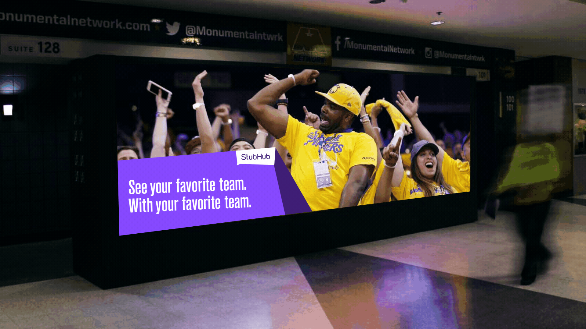
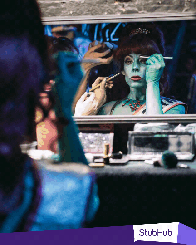
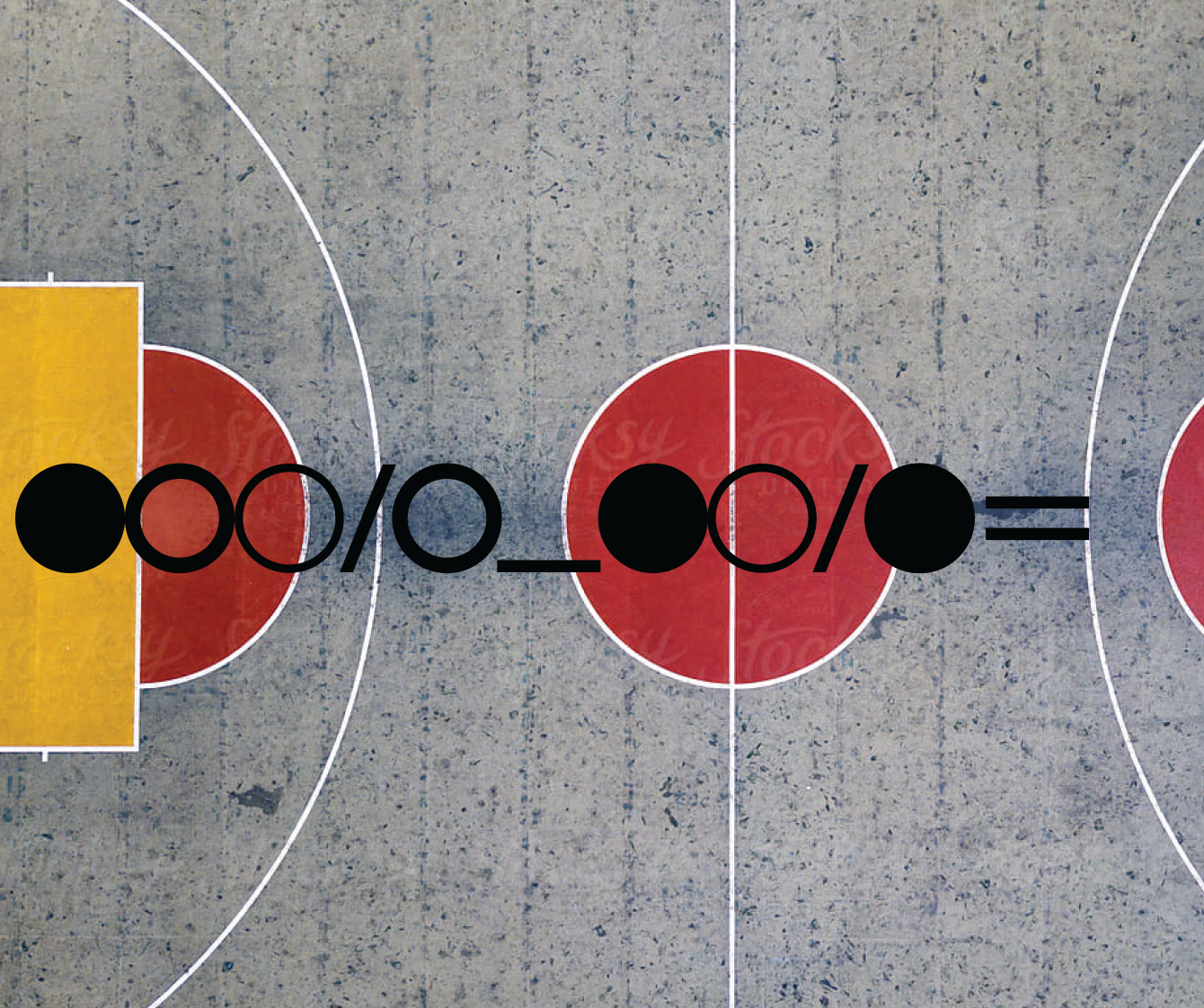
The creative direction and storytelling lens focused on creating an intimate snapshot of the authentic joy that fans experience at live events everyday, around the globe - through photography and design.
The design system leaned into the companies dominant heritage color (purple) expanding the palette, new, more efficient typefaces for robust digital marketing, and wrapping it in a system and revealing animation that created energy and vibrance for our intimate and authentic presentation of live events.
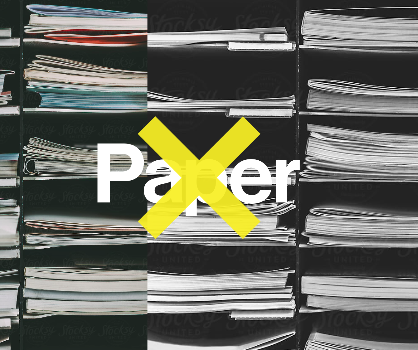
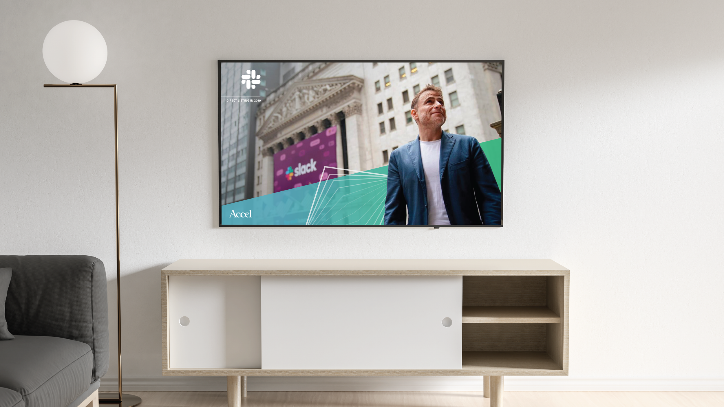
StubHub
StubHub


-
— Type: Public / Nasdaq (EA)
— Category: Gaming
— Net Revenue: 6-7B
— Players: 580M active accounts -
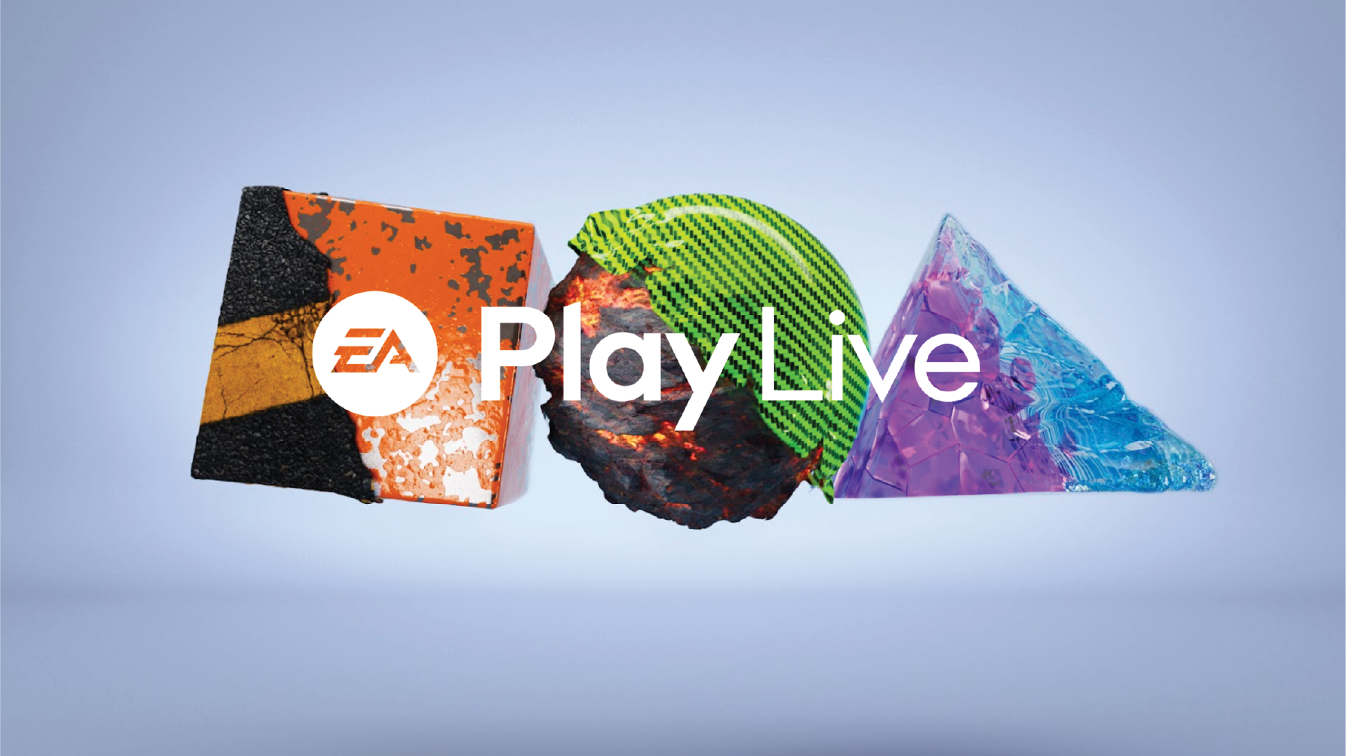
The ask was to craft a new, vibrant, flexible and meaningful VIS-ID system to launch alongside a new global Brand Strategy; We Are Play Makers.
The global umbrella parent / hero brand (EA vs. the game studios under EA) had become disjointed and wasn’t remotely consistent. Even the EA medallion logo mark continued to be versioned.
The global EA brand didn’t stand for anything anymore. Should this umbrella brand for dynamic storytelling and game creation for a diverse community of gamers across the globe be a champion of more? How do they keep players coming back to its platform and Studio franchises?
A new narrative and brand strategy and robust creative direction could help communicate new ideals for the company as the world and culture continues to change around it.The goal of the work is build more affinity among players as EA continues to build awesome experiences for everyone, everywhere.
-
The strategy gets back to basics and emotionally connects our audiences with the simple and pure idea; play is good for all of us. And EA is in the business of play and will champion the best aspects of it.
Belief:
When we play the world is a better place.
Mission:
Inspire the world to play.
We Are Play Makers. We relentlessly explore new ways to bring play to life
Pillars:
Player, Product, Growth & Purpose. -
EA has a vast network of game Studios, creative employees, artists as well as design needs for marketing. The VIS-ID needed to be meaningful to all of these stakeholders and partner agencies alike.
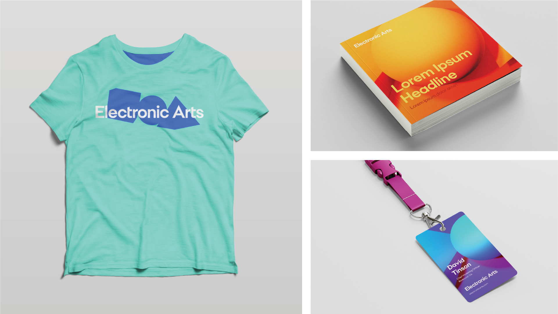
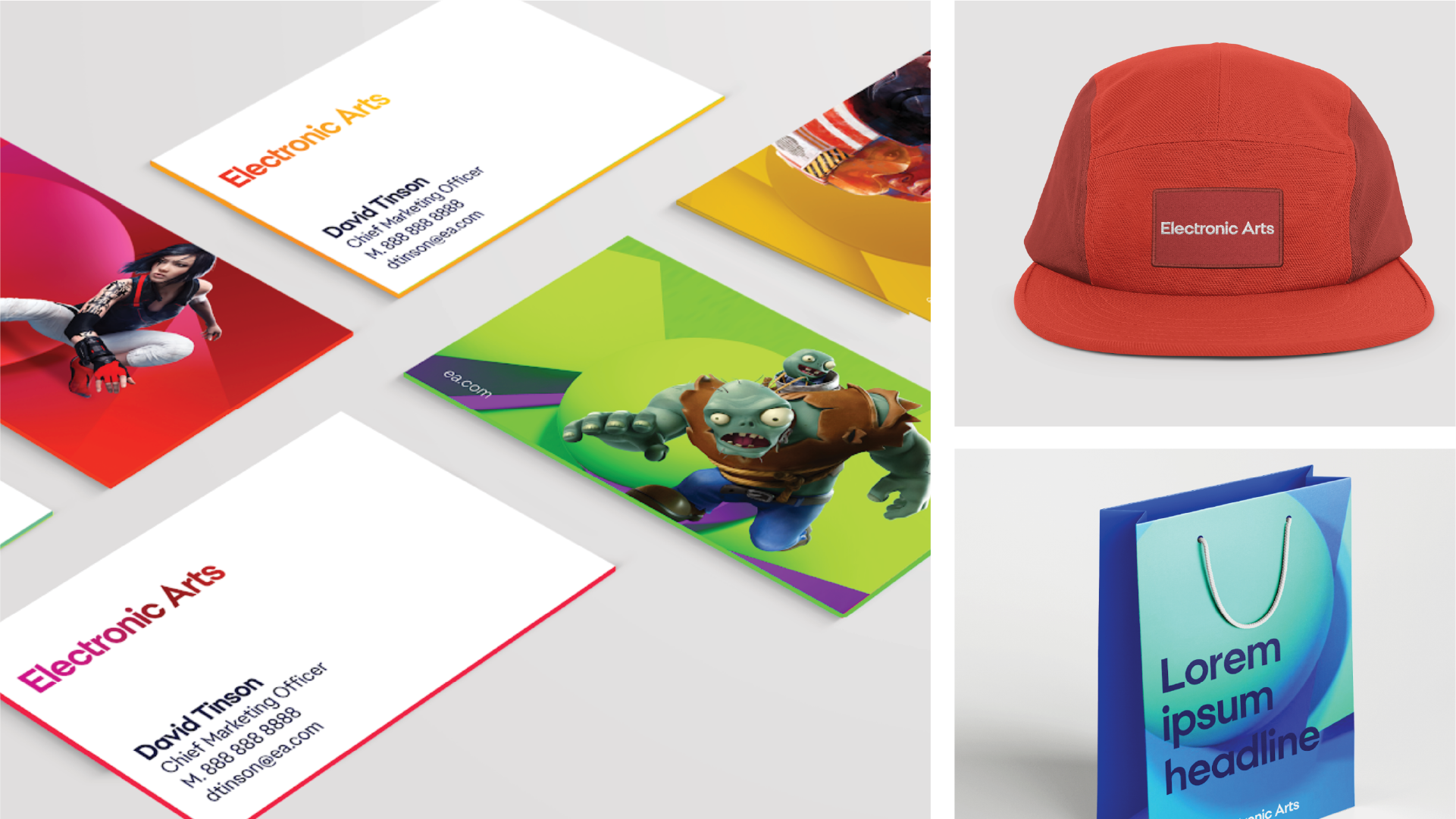
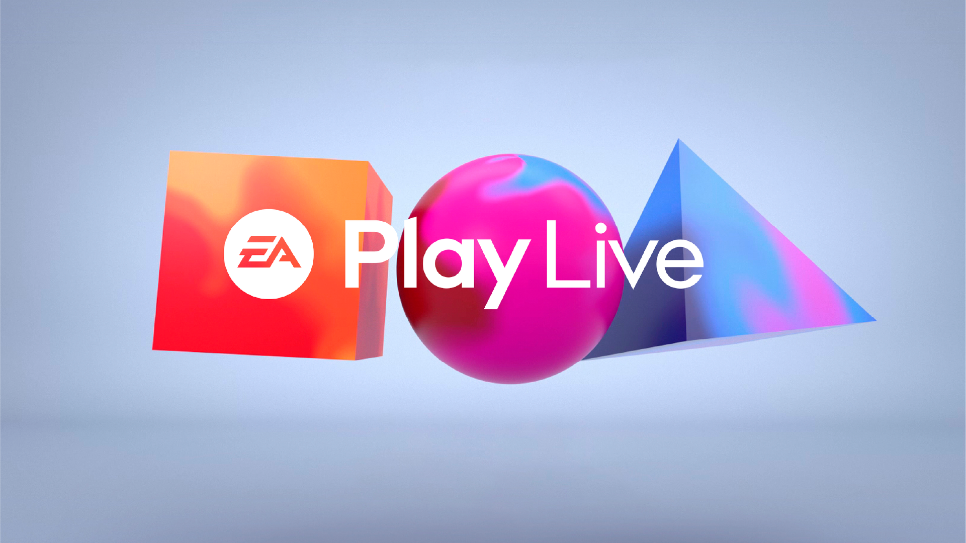
We focused on a simple, yet powerful idea. Modernizing an original brand design idea EA had when it was founded in the 80’s. A collection of geometric shapes as building blocks for making art. This idea is in the company’s DNA.
The creative direction brought these shapes into the world of gaming creating a unlimited system in which to bring color, content, texture and materials through.This shape world (mostly 3D) is paired with a new, inclusive color system (Spectrum) representative of EA’s portfolio of Studio franchises. The hero brand is really comprised of the sum of its parts - its games.
A new custom typeface was also designed, and used for a new wordmark. The original EA medallion (circle mark) was retained for the new VIS-ID system.
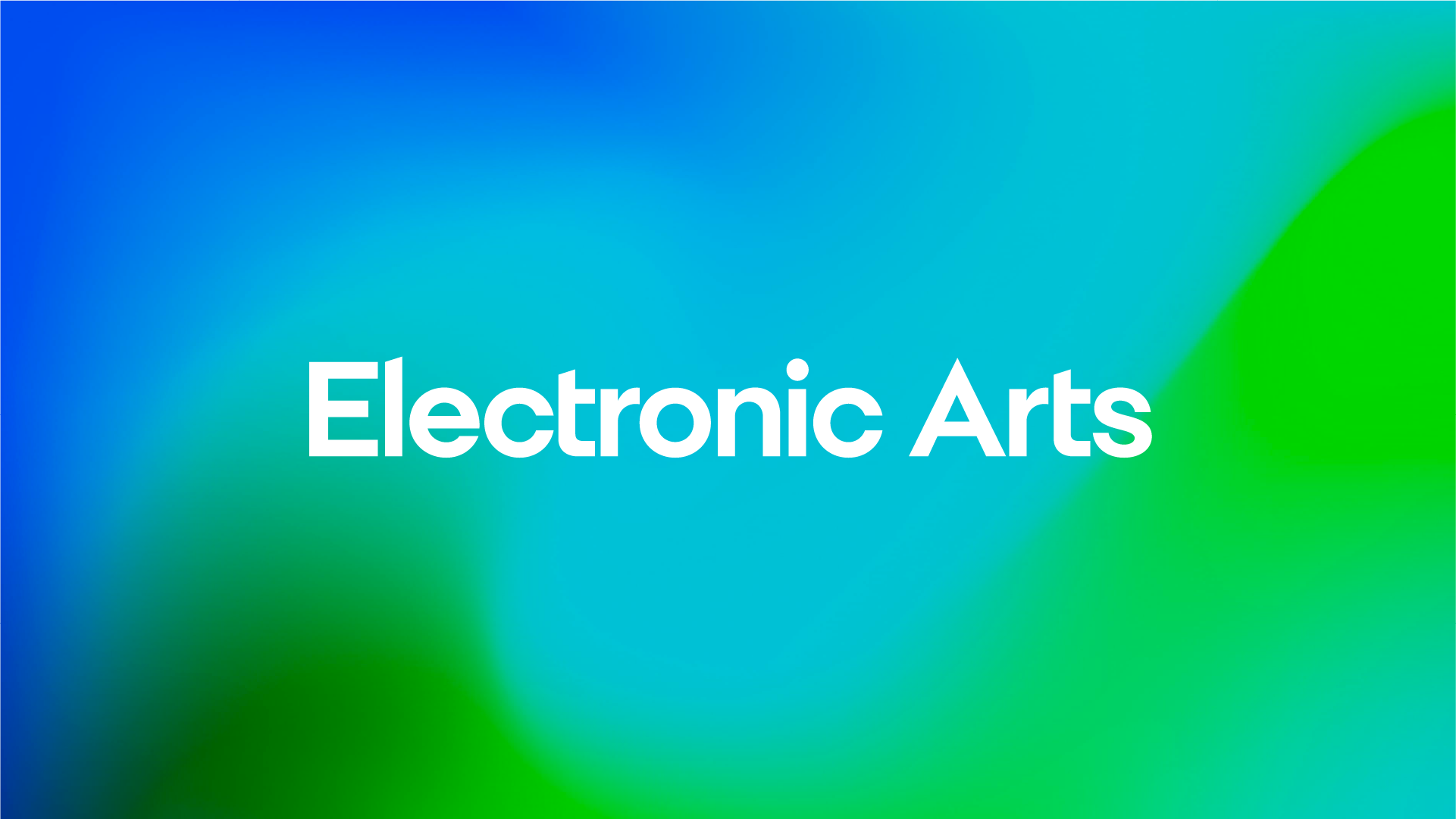
Electronic Arts
Electronic Arts


-
— Type: Public / Nasdaq (DOCU)
— Category: Digital Agreements / eSignature leader
— Net Revenue: 2B
— Customers: 1.17M -
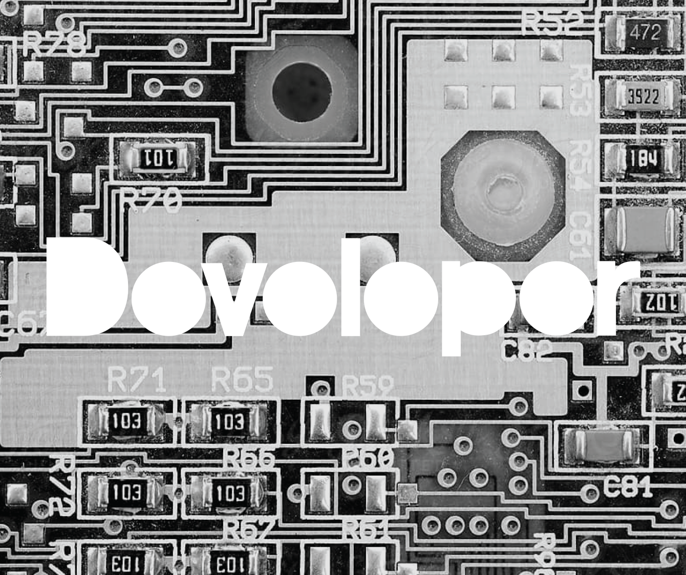
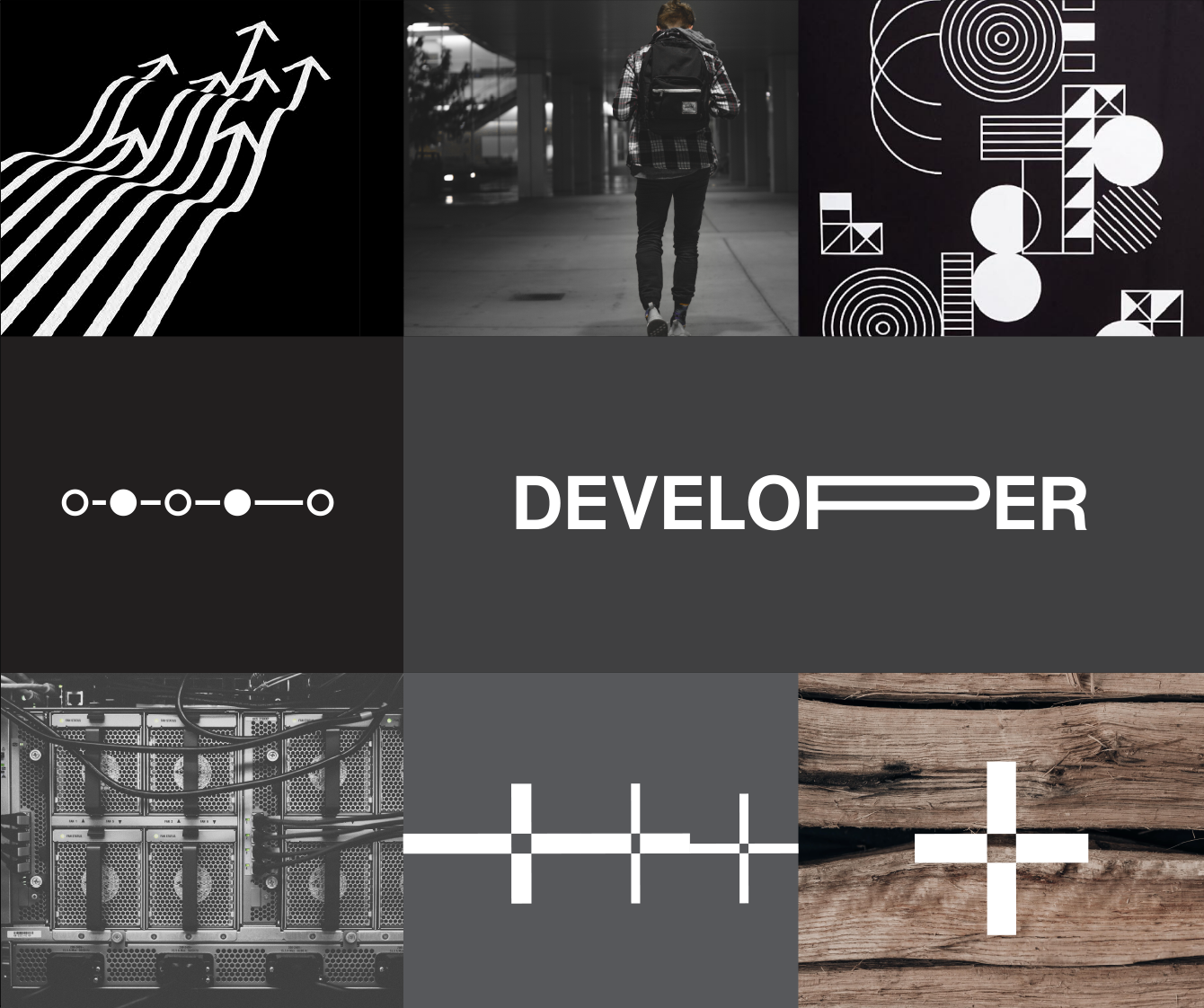
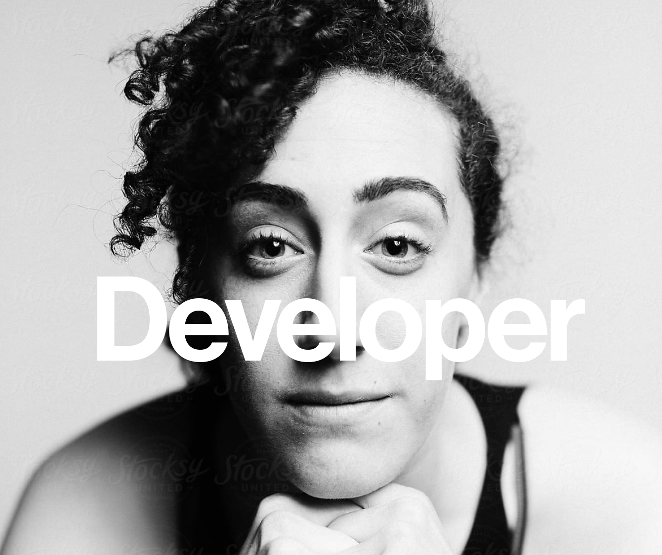
To coincide with the forthcoming redesign of the VIS-ID system (and new wordmark), create the first program look/feel package for the Developer audience segment and partners - that aligns with where the hero brand is going, creatively.
This includes a program level mark for DocuSign + Developer. -
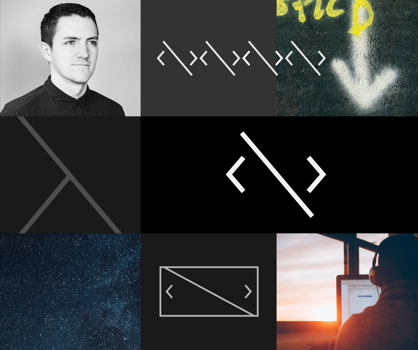
The creative direction was rooted in an editorial approach depicting a day and the life of a developer, building what’s new and what’s next in the world. This focus showed a true understanding of who they are and what their days and nights are like.
Brand photography is steeped in light, texture, environments, moments, emotions/expressions, and inclusion to communicate we understand them as people and partners.
The design system is built around simple and elegant typography, aligning to the new hero brand development, and modern graphic elements that pay homage to the language of code, visually.
DocuSign — Developer
DocuSign — Developer


-
— Type: Private
— Category: Venture Capital
— Funds: 600M-4B
— Portfolio: 900+ companies -
Craft new, refined design elements and a brand color system for marketing, social, comms/PR, events and ephemera for employees.
The exploration yielded design opportunities for program and initiative marks, new typography, photography, and expressive visual storytelling, thus creating an evolved VIS-ID system. -
Accel is one of the early founders of venture capital in Silicon Valley. They’ve accomplished a lot of firsts in 35+ years, but feel incredibly relevant, fresh, modern, and understated/ unassuming internally.
The creative direction shines a light on this innovative firms approach through the lens of the art and science of investing. New expressive color (hero brand + portfolio companies) paired with motion orientated line work supports the new visual storytelling. The photography pushes toward artistic textures visually communicating and the act of creating something new.
The design direction also takes inspo from the angular wordmark, and provides for new design opportunities for unique and forward thinking items for employees and friends of the firm.
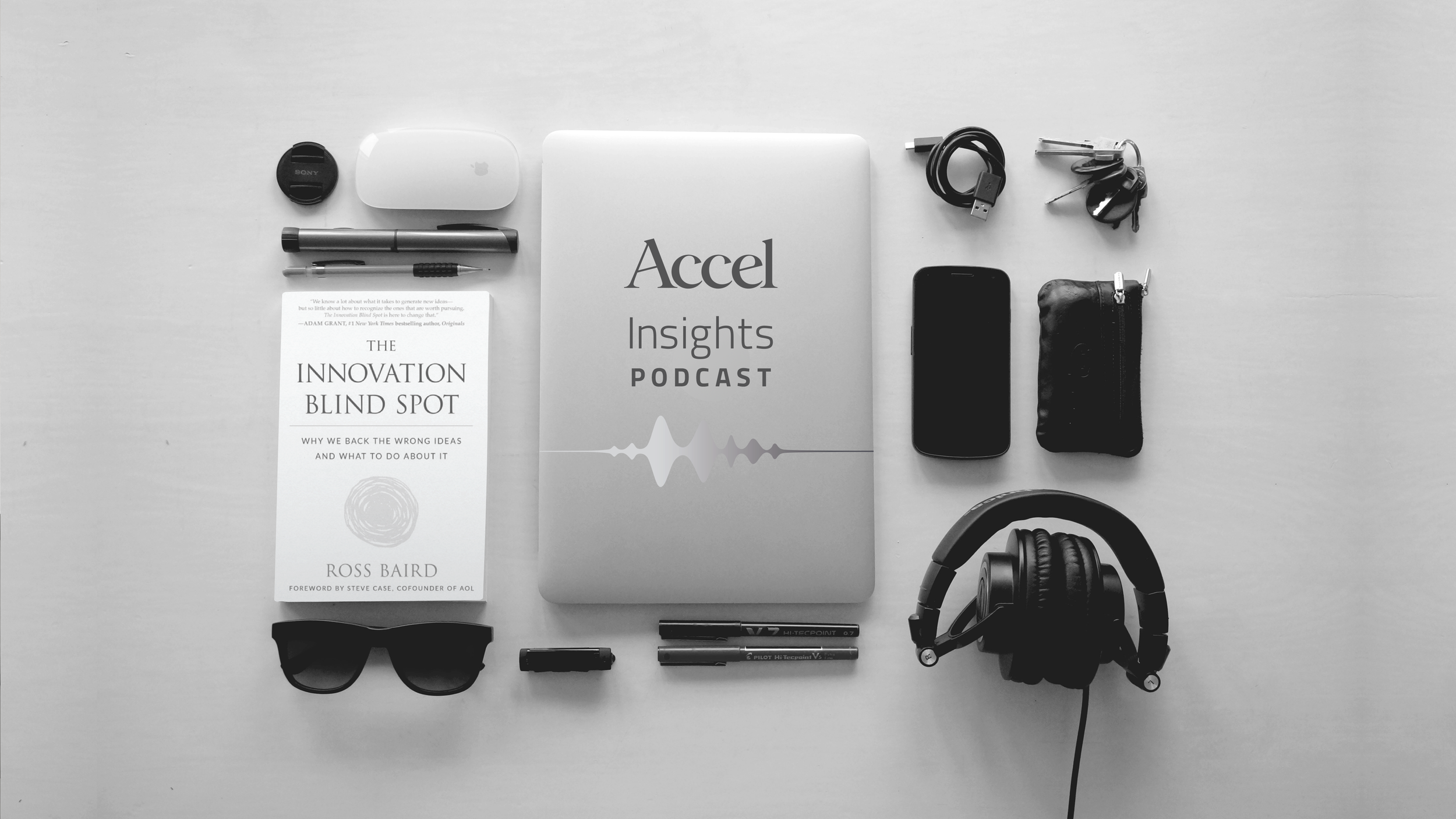
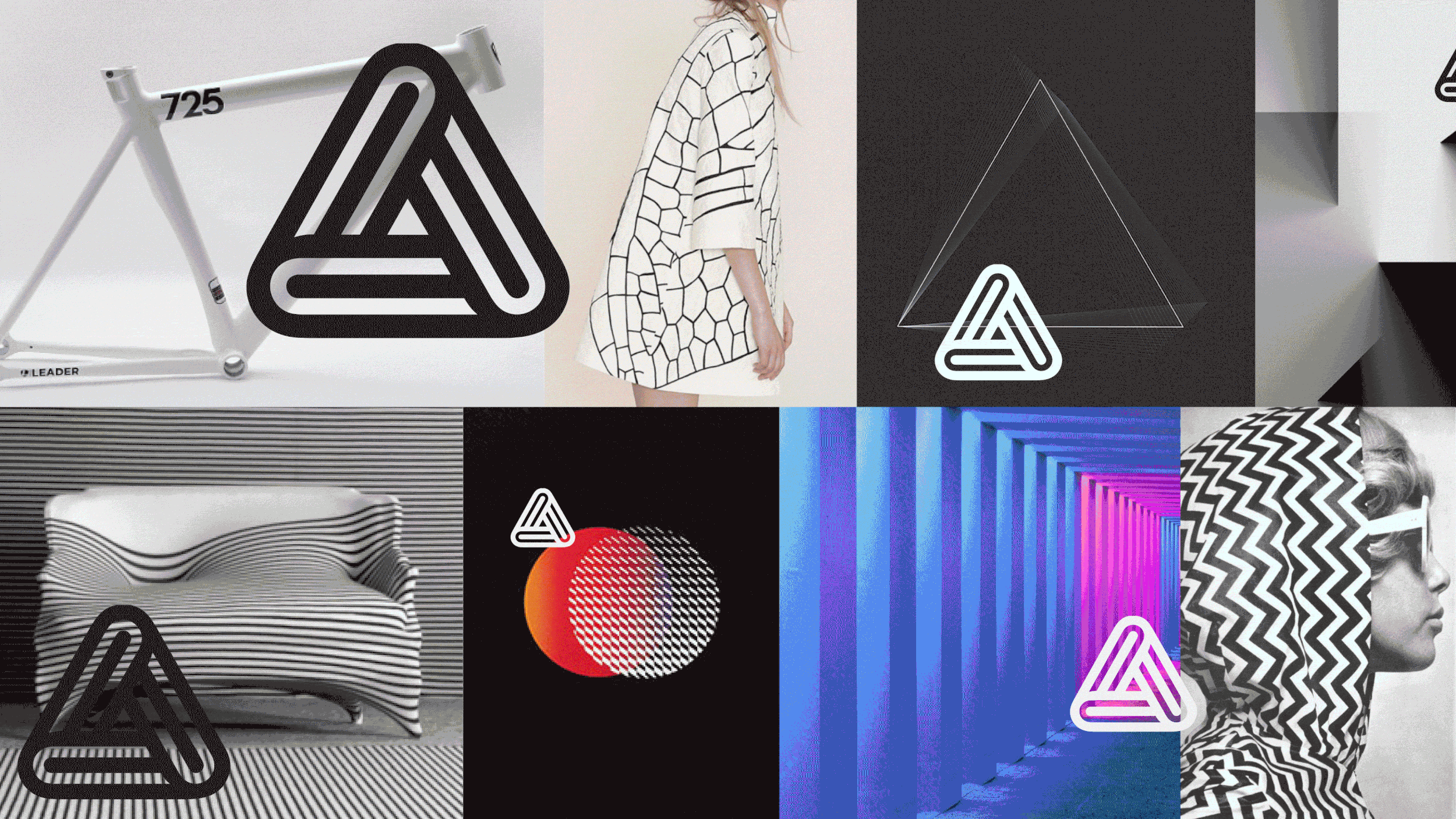
Accel — Venture Capital
Accel — Venture Capital


-
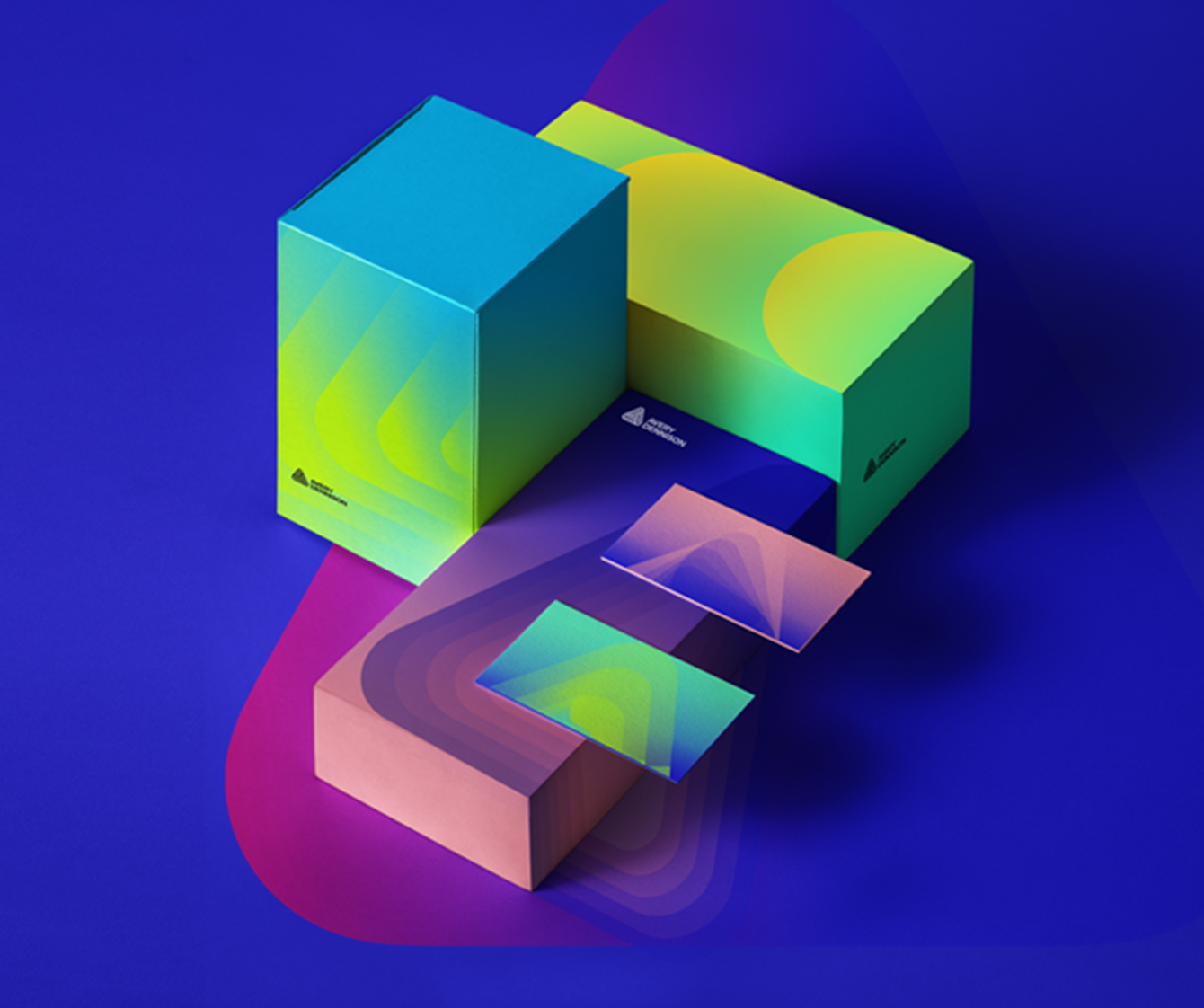
— Type: Public / NYSE (AVY)
— Category: Materials Science & Manufacturing leader
— Net Revenue: 750M -
Refresh the VIS-ID to align with the company’s new brand narrative and reflect its business ambition, while unifying the diverse business groups through a strong central (hero) brand.
The general public knows Avery as a brand (stickie notes) but through M&A, Avery Dennison is the parent company and primary VIS-ID brand. We were tasked with bringing the new narrative to life through design. -
Establish Avery Dennison as an innovative materials science and connected products company in the minds of employees, clients, and prospects with a “responsibly revolutionary” visual identity system that drives excitement, interest, and engagement.
Brand Idea & Narrative:
Dynamic Intelligence. Bold Imagination.
Avery Dennison is powerful not only because of our expertise, but the way we dream—and the way we bring those dreams to life. -
Designing material science allowed us to paint the creative direction with a pretty broad brush. The visually rich visuals and textures were always going to be a prominent piece of the VIS-ID. Plus an energetic color palette + the iconic AD red.
The design system is as vivid as it gets; photography, color, typography and the graphic language all communicate a future forward feeling.
We also found inspo in the brands symbol originally designed by Saul Bass. We treated it as another flexible vehicle for design and layered storytelling. The symbol variations visually connect the company to innovative product moments, textures, and photography as a foundational piece of the story.
Avery Dennison
Avery Dennison


-
— Parent: Office Depot & Office Max
— Type: Public / Nasdaq (ODP)
— Category: Business services, supplies & products
— Net Revenue: 8B -
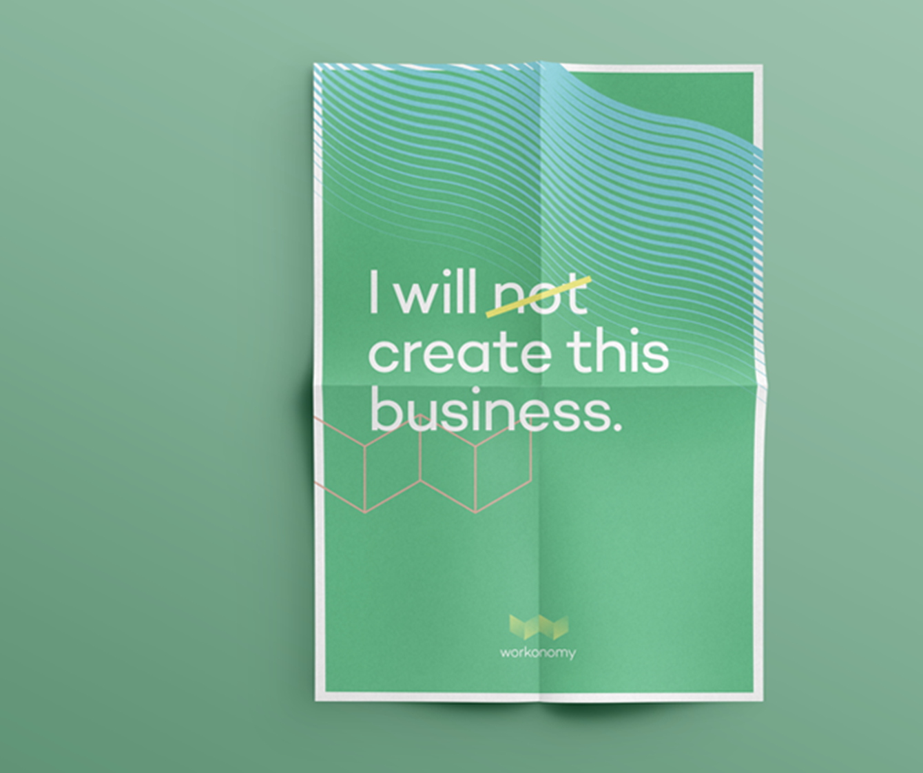
How do we become the unprecedented, preferred resource for the business-minded customer?
Push into co-working. Break a routine, get exposed to more by getting out of the house/home office. It’s not about buying/selling stuff. It’s about ideas, finding inspiration and connecting w/ other people doing similar things.
Develop a unique name and brand for hybrid approach to a new retail format and footprints. Business solutions meets humanity.
-
Context:
SMB solutions are scattered, and professionals need products and services delivered in every possible manner.Difference:
Office Depot is the best omni-assistive business resource — uniquely capable of seamlessly bringing you the right solutions, and advisors.
Benefit:
Giving all SMB’s and startups to support with a human touch, for their unique workplace needs wherever and whenever they need them.
Principles:
Simplicity, Adaptability, Humanity
Naming:
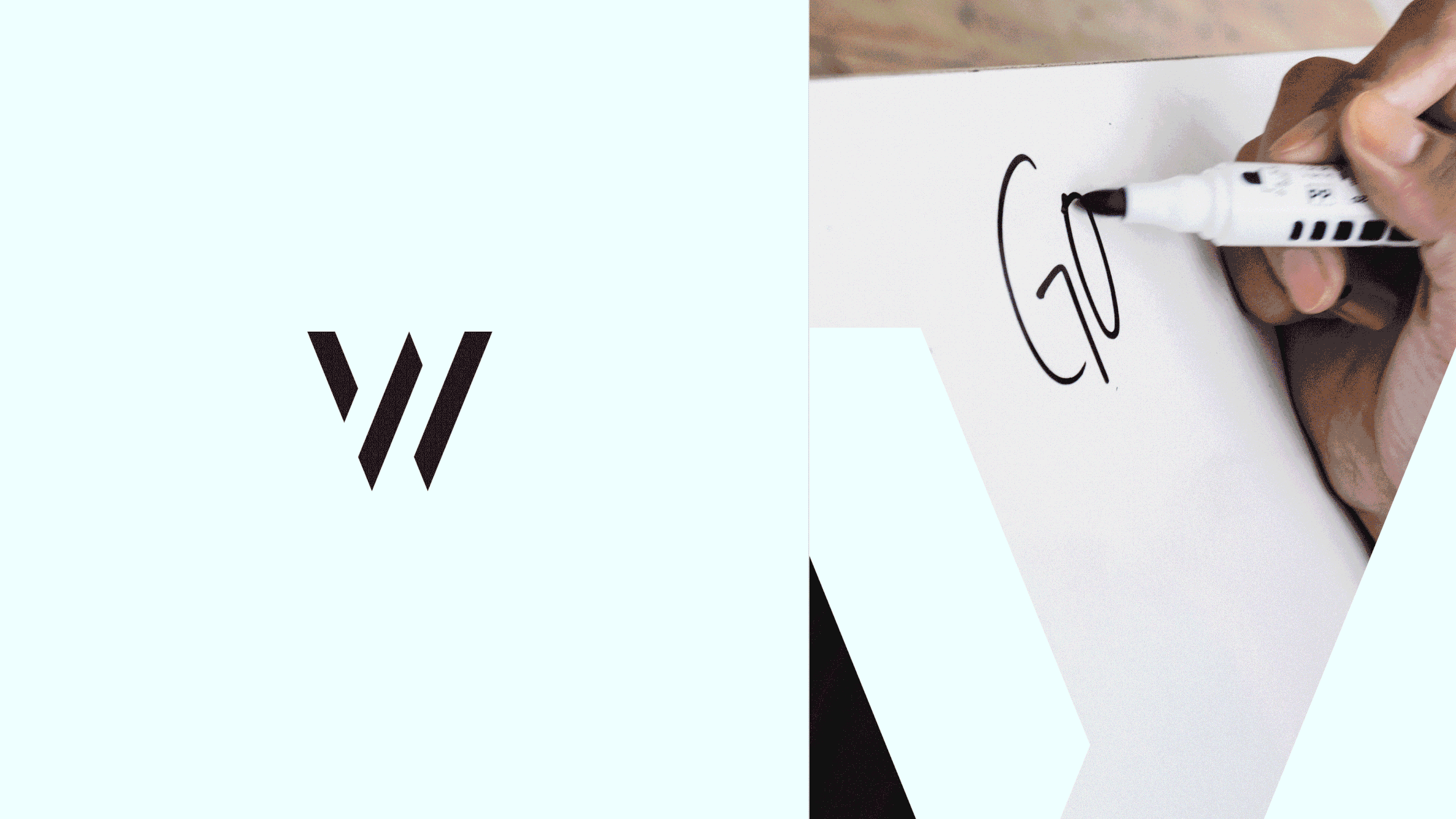
Workonomy. Our name comes from an understanding that business today is about more than just commerce. -
The creative direction aligned to the strategy to design an anthem-like new VIS-ID (with new name) to break into the co-working space category focused on new business owners and entrepreneurs. Retail + co-working.
Focused on people, our humans starting something, and the feeling that every day is Day One as a rallying cry, the design direction is bright and bold, and full of positive energy type vibes. A sense of bravado, spirit, whimsy, confidence drives the photography direction. And the color palette is varied, diverse and high contrast.
The logo mark feels light and airy with a sense of movement and progression in the flexible W as wing form. The graphic language and line work has a diagrammatic, layered feel to help tell a multi-faceted story about designing/making something.
Workonomy
Workonomy


-
— Parent: Alphabet, inc.
— Type: Public / Nasdaq (GOOG & GOOGL)
— Category: Conglomerate
— Net Revenue: 349B -
Coming soon
-
Coming soon